On this page there’s 8 highlights (premium only) outlining what Nike are doing right and wrong. (Tip: use the arrows above or on your keyboard to navigate all 1040 customer info & address examples.)
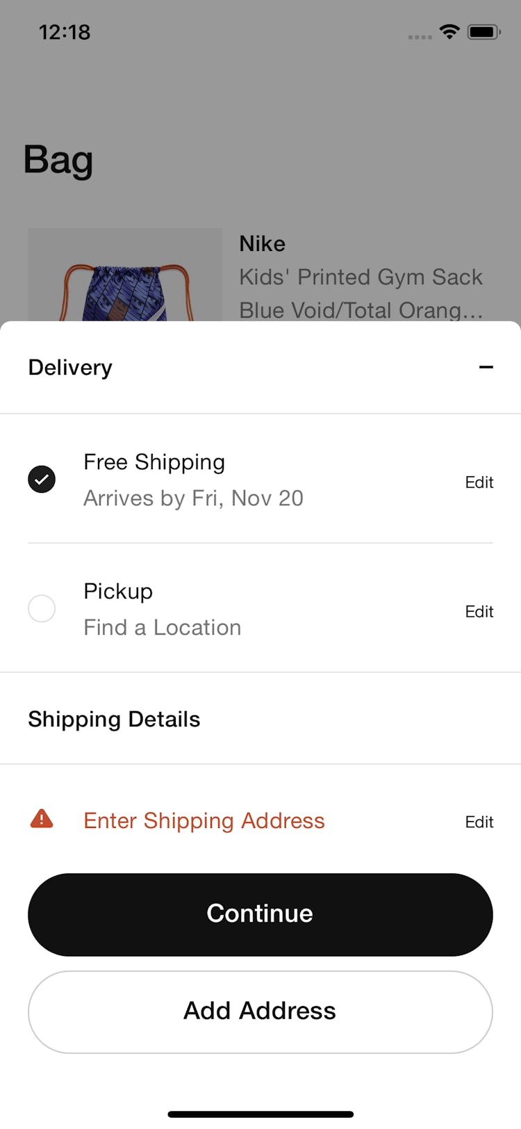
The screenshot was taken on November 11, 2020 and depicts Nike’s Customer Info & Address. In total, we’ve reviewed 98 of Nike’s page designs. To see them all, visit the full Nike UX case study.
Research Guideline #544
Importance: Essential · Multi-Platform
Dig deeper: Implementation breakdown, 1 extra image, Underlying UX research
This content is only available in Baymard Premium — get full access
Research Guideline #550
Importance: Impactful · Multi-Platform
Dig deeper: Implementation breakdown, UX advice, Underlying UX research
This content is only available in Baymard Premium — get full access
Research Guideline #543
Importance: Impactful · Multi-Platform
Dig deeper: Implementation breakdown, 1 extra image, Underlying UX research
This content is only available in Baymard Premium — get full access
Research Guideline #548
Importance: Detail · Multi-Platform
Dig deeper: Implementation breakdown, UX advice, Underlying UX research
This content is only available in Baymard Premium — get full access
Research Guideline #633
Importance: Impactful · Multi-Platform
Dig deeper: Implementation breakdown, Underlying UX research
This content is only available in Baymard Premium — get full access
Research Guideline #631
Importance: Impactful · Multi-Platform
Dig deeper: Implementation breakdown, UX advice, Underlying UX research
This content is only available in Baymard Premium — get full access
Research Guideline #931
Importance: Detail · Multi-Platform
Dig deeper: Implementation breakdown, Underlying UX research
This content is only available in Baymard Premium — get full access
Research Guideline #632
Importance: Impactful · Multi-Platform
Dig deeper: Implementation breakdown, Underlying UX research
This content is only available in Baymard Premium — get full access