Form Usability: Getting ‘Address Line 2’ Right
“Address Line 2” form fields — where users add an apartment number, suite, or other “secondary” address information — will often only be used by a minority of users.
While there’s nothing wrong with including “Address Line 2” in the address form, our large-scale Cart & Checkout testing reveals that the “Address Line 2” form field can be a surprisingly difficult hurdle for some users to overcome when filling out their address information.
In fact, our usability testing shows users coming to a halt and puzzling over the field, inputting incorrect information in the field, or simply becoming distracted by the field and staring at it, without ever entering any information into it. For some users, the field is quite frustrating, increasing the chance that they would leave the checkout without completing it.
In this article, we’ll discuss the test findings from our Cart & Checkout usability study related to the “Address Line 2” field. In particular, we’ll discuss:
- Why “Address Line 2” fields are so distracting for some users
- How to include “Address Line 2” in the address form to avoid distracting users
- 3 UX Implementation details to consider for “Address Line 2”
“Address Line 2” — A Surprisingly Distracting Field
It may seem that “Address Line 2” — which likely won’t be used by many users — would simply be ignored by those users who don’t need to input anything in the field.
During testing at ASOS, multiple users stopped and were unsure how to correctly fill their street address in the “Address 1” and “Address 2” fields, often clicking and moving parts of the street address back-and-forth, before finally deciding on how to proceed.
At Walmart, another user, after having typed her full street address, tabbed once and started typing her city name — only to notice it was the “Address Line 2” field. She deleted the input and tabbed once more, then typed her city name.
Yet, during testing, users were often observed to be confused by “Address Line 2” fields, which made 30% of users come to a stop and furthermore made some question if their initial “Address Line 1” input was correct.
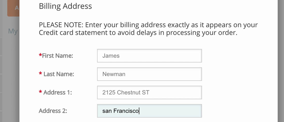
Having provided the street number in “Address Line 1”, this user tabbed to “Address Line 2” (first image), and only then realized that both the street number and street name should be placed in the “Address Line 1” field (second image).
During our large-scale eye tracking testing, users were often observed to rely on the location of form fields — and not always read the labels — to determine what fields to complete and how to complete them.
Hence, many users inputting their address information are likely to not read the label “Address Line 2” — instead, they’ll simply continue filling out their address information, only to realize later that they’ve entered information in “Address Line 2” that shouldn’t be there.
Even on forms that more explicitly label the “Address Line 2” field, users still came to a halt during testing. Here, at Crate & Barrel, a user said, “I’m trying to establish an overview over what…Um…I’m thinking. What information is necessary to type next, and is it relevant for me?”.
Furthermore, while “Address Line 2” fields are always optional, we consistently observe that optional inputs presented as open text fields nevertheless demand a disproportionate amount of attention — seen especially in our eye tracking study gaze plot data — as users still have to notice that the field is optional and determine whether the field is relevant for them.
In order to understand whether it’s relevant or not users will need a somewhat good understanding of address formatting and structures, and it was in particular observed that the users without anything to input in the “Address Line 2” field struggled with understanding it.
Besides the high amount of focus, another commonly observed issue with the “Address Line 2” field during testing is field ambiguity, with users often wondering if they should type all street information in “Address Line 1” (street name, number, apartment floor, apartment number, etc.) or divide it into two, following the logic of “Two form fields, two inputs”.
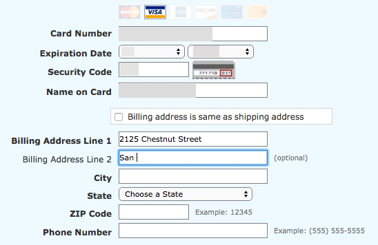
At the billing address step at Cabela’s, a user initially types in the address correctly. However, once she spots the second address line she deletes the “2125” part of the already inputted address (first image) and types it in the secondary address field instead (second image). Other users had similar issues; as one said, “I’m really getting goddamn frustrated — that one [“Address Line 2”] has to be for the number”.
The presence of an “Address Line 2” field can therefore unintentionally confuse users who don’t have any use for it.
During testing, most users were able to solve this issue themselves and the presence of an “Address Line 2” form field will therefore seldomly provoke a direct validation error. Yet it should be noted that users will generally go to great lengths to try and preempt validation errors during the checkout process.
Hence, even though “Address Line 2” may not directly provoke a validation error, testing showed how “Address Line 2” often results in users coming to a complete stop in the typing flow and making mistakes when entering their shipping information — resulting in a needlessly cumbersome typing experience.
How to Include ‘Address Line 2’ in the Address Form
After filling out the “Address Line 1” field at REI a user tabbed through the “+ Add Address line 2” and “+ Add a company name” links. The user was clearly aware that they were there — as evidenced by the eye tracking gaze plot data that show the user staring at the links — but the typing flow isn’t interrupted.
A design pattern that during testing was observed to perform well is to simply hide the “Address Line 2” form field behind a link. By only permanently displaying “Address Line 1”, users are much less likely to second-guess their initial input, as there’s no immediately available option to divide the address in two.
As importantly, on the sites that provided a link to reveal the “Address Line 2” field, our eye tracking testing revealed that all users noted the links before moving on or engaging with them.
This is a crucial detail, as the subset of users who do have a use for “Address Line 2” of course need to be able to spot the link.
Besides reducing ambiguity and speeding up typing, an additional bonus of hiding “Address Line 2” is showing one less form field by default, making the step feel less intimidating.
Note: hiding “Address Line 2” behind a link is naturally only advisable if the majority of site users don’t need it. If a significant amount of users do need “Address Line 2”, it should be permanently visible as a form field. If in doubt, it’s advisable to run a custom analysis of the current order data to gauge the usage, but also analyze the type of usage (i.e., the amount of wrongly submitted “Address Line 2” data).
3 UX Implementation Details for ‘Address Line 2’
Hiding the “Address Line 2” field behind a link is a good first step toward improving the usability of an address form. However, there are three important implementation details to get right when including “Address Line 2”:
At Nordstrom no fields are marked as required or optional, making it difficult for users to know which fields they must complete to check out.
At Adidas, it’s obvious which fields must be completed as they’re explicitly marked as required (red asterisks) or optional — making it much easier and faster for users to complete checkout forms.
1) When collapsed or expanded, the visible address line fields (and all other form fields) should be explicitly denoted as required or optional. On the sites that didn’t explicitly denote both field types, users spent more time filling out the fields and more frequently ran into entirely preventable “Field is required” validation errors.
In fact, when testing mobile checkouts, 75% of the test subjects experienced severe form usability issues on sites that failed to mark both required and optional fields clearly.
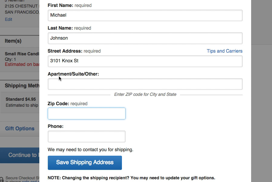
At Crate & Barrel, all users during testing who tabbed through the “Shipping Address” form were interrupted, as a “Tips and Carriers” inline link stole keyboard focus as they tried to tab from one field to the next.
At Sears a tooltip link for the phone number field is skipped when tabbing through the form, helping users stay on track with checking out.
2) Links for revealing form fields such as “Address Line 2” should be part of the keyboard tabbing flow, while links for help and tooltips should typically be skipped in the keyboard tabbing sequencing.
During our checkout usability study, 62% of the test subjects used the keyboard tab key to navigate through form fields.
However, secondary links used for tooltips and disclaimers in forms proved disruptive to subjects who were tabbing.
Considering that users who are stuck or in need of help will need to spend several seconds, if not minutes, to find, read, and understand any help, the ability to save around 0.5 seconds by being able to tab and then click “Enter” into the tooltip is relatively small compared to the friction it presents for every single user, who doesn’t need help, and will instead have to tab through the tooltip to progress to the next form field.
Therefore it’s worth considering specifying a custom tab order for tooltips and similar links, thereby “skipping” certain items.
At J.C. Penney, “Address Line 2” is placed immediately after “Address Line 1” and has a “+” icon to indicate it expands when clicked.
3) The link revealing the hidden “Address Line 2” field must be styled so it’s clear it expands into an additional form field. This means placing the link right after the “Address Line 1” field (below or to the right), adding an indicator such as a “+” icon, and using “add” terminology as part of the link text.
Ensure ‘Address Line 2’ Doesn’t Bring Users to a Halt
When testing Amazon, a user completed “Address Line 1” with ease, then tabbed. When the user saw that she was in “Address Line 2”, she came to a full stop, pausing for some time, before finally deciding to move on.
The “Address Line 2” field certainly isn’t that one single thing that will make or break your entire checkout experience. It is, however, one of those 10–20 smaller improvements that it takes to lift a checkout experience from good to great.
Hiding “Address Line 2” behind a link is, for most sites, a simple incremental way to improve the checkout experience without requiring many resources to implement — in other words, low-hanging fruit.
In addition to hiding “Address Line 2” behind a link, it’s important to:
- explicitly mark the field (and all other form fields in checkout) as “required” or “optional”,
- include “Address Line 2” as part of the keyboard tabbing flow, while ensuring tooltips and other help links aren’t, and
- make it clear “Address Line 2” can be expanded by using an icon or text.
Yet only 5% of sites hide “Address Line 2” behind a link.
This article presents the research findings from just 1 of the 580+ UX guidelines in Baymard Premium – get full access to learn how to create a “State of the Art” cart and checkout user experience.
User experience research, delivered twice a month
Join 25,000+ readers and get Baymard’s research articles by RSS feed or e-mail:
Topics include user experience, web design, and e-commerce
Articles are always delivered ad-free and in their full length
1-click unsubscribe at any time
We first published an article on the topic of “Address Line 2” fields in November 2014, this article have been rewritten entirely with our newest usability test findings.
Related Articles
More E-Commerce Research
Free Research Content:
- Popular Articles · a listing of our most popular research-based articles on e-commerce UX
- UX Benchmark · benchmark with case studies of 123 major e-commerce sites ranked by e-commerce UX performance
- Page Designs · navigate 9,200+ manually annotated full-page screenshots categorized by page type
Products & Services:
- Baymard Premium · full access to all 619 research-based design guidelines, UX case studies, page designs, and review tool ($720-$3,000 / year, based on plan)
- UX Audit · get an in-depth analysis of your site’s UX, conducted by a Baymard researcher ($1,900-$9,700 based on scope)
Comments
Premium Research
Get full access to Baymard’s 78,000+ hours of research and empower your UX team and decisions.
Audit Service
Get Baymard to audit your site’s UX performance, compare it to competitors, and identify 40 areas of improvements.






Elizabeth BuieNovember 4, 2014
Great post, and useful. There’s just one thing that bothers me: I don’t see the benefit of labelling these “line 1” and “line 2”, as it seems to me that that labelling comes from programmers. I would try labelling the first one “Address” and the second one “Address (cont.)”, and see how that tests. I haven’t had the opportunity to test it myself, but next time I get a chance I will do so (unless someone else comes up with the results first).
Jamie, Baymard InstituteNovember 4, 2014
Hi Elizabeth,
I like your idea of trying to name the labels something more plain. The ‘line 1’ and ‘line 2’ are references to physical (print) forms where the address is often filled out across multiple ‘lines’, although that suffers from being an increasingly less obvious metaphor (as paper forms become less and less common) and of course taps into the inherent limitations of the printed medium. Would definitely be interesting to test out a wide range of labellings and see which users find the most natural.
JamesNovember 7, 2014
I’ve always wanted to test changing the address line 1 & address line 2 to a textfield of just address (and then keep postcode as normal).
Does that test well do you know?
Laura MoraitiNovember 7, 2014
This is a very insightful post, and I like how you break down the pitfalls from specific examples… BUT, is that second line really necessary?
I usually write my whole address in the first line because (simplest reason of all), mailmans in my country they tend to not deliver if the address is a tad off (if you miss-typed one letter they won’t deliver, even knowing the correct address). So, when presented with two lines I always wonder how it will be printed in the package. Will both lines be printed? Will one of them be ommitted? I can’t take any risks!!
My suggested approach, stop wasting time deveoloping ‘adders’ to add a new line and instead use a simple textarea with a length limit. You don’t want the Bible written in the address field, but you want to let the user complete the whole info without feeling pressured to think about what will be printed / how it will be interpreted /etc.
Christian, Baymard InstituteNovember 7, 2014
Hi Laura, if there’s a low utilization rate one can do like shown in the Crutchfield example in point #5 (simply having one address field).
Laura MoraitiNovember 7, 2014
Yes, but, it’s not comfortable. Imagine your address is not long enough to occupy two inputs, but it’s long enough to not been seen completely while filling the input.
I feel the low utilization rate could simply be obsoleted by using a textarea with a limited amount of chars (80, 100, whatever) and styling it to look like a double tiered input (to not disrupt the design flow). Adding the huge plus of seeing the entire writing without the need to move with the cursor back and forth.
I’m curious to know what’s the drawback you find to a small textarea, I’m perhaps missing something.
Christian, Baymard InstituteNovember 11, 2014
Hi Laura, we don’t disagree here, we mention a multi-line field in the article as well (e.g. it can depend on the sites specific field width and input font styling). In fact our mobile usability testing find that masking part of the users input can cause severe issues – see this article http://baymard.com/blog/mobile-form-usability-label-position
Tomas KaplerNovember 7, 2014
And what about simple 2 rows textarea?
Christian, Baymard InstituteNovember 11, 2014
Hi Tomas, yes as mentioned in point #5 in the article on can also consider a multi-line address field. We don’t have any particular test observations on this implementation, but the size of the field will allow it to display most inputs in full (without partly masking the data – as Laura also mention as an issue with a single line address field).
Just to cover all variations: Two separate fields with only 1 label is however a poor option, see example here http://baymard.com/checkout-usability/benchmark/step-type/shipping-address/21-office-depot-step-3 , as the second line will be labelless and thereby not address issue #2 and #4
Eric ScheidMarch 9, 2015
Please do note that what goes into line 1 vs line 2 is also country specific.
For example, in Australia, the building name goes into line 1, with the street number and name in line 2.
This is pretty comprehensive: http://www.bitboost.com/ref/international-address-formats.html#Formats
james turnerMarch 2, 2016
technically, that is how you are supposed to do it in the united states too. unfortunately, no one seems to be familiar with usps regulation 213.3. so, most people do it wrong (including amazon apparently).
http://pe.usps.com/text/pub28/28c2_003.htm
paulSeptember 5, 2018
Similarly I’m surprised the article makes no mention to the USPS standards. USPS specifically wants the Apartment #, etc to be on the same line as the street. If there is not enough room on a single line, its standards actually say it wants it put above the street, not below. No mention of an “Address Line 2”. We’ll be implementing a single Address line for street number and name and a short list select for unit designator and short field for the unit approach. We’re only dealing with US based addresses, however.
Charlie DJune 12, 2015
What if you put the same address on both lines? I recently did that, then I edited my address. Yet, it still has both address lines on my order history….Should I be worried at all?
JessieJune 24, 2015
If you got feedback that “Address 2” was confusing, then it seems that “Address Line 2” would still be a little bit confusing.
Is there a reason to not label it: “Apartment, Suite, Unit, Etc.”?
james turnerMarch 2, 2016
because sometimes the apartment number goes on line 1 and sometimes it goes on line 2.
e.g.
apt 203
123 main st
vs.
c/o nancy thurman
123 main st apt 203
JonathanJanuary 13, 2017
I think the problem is not that people do not understand how to use address line 2, but that companies do not and this makes people (myself included) try to cheat the system to make an address print correctly.
As others have commented, it should be Addressee, apartment, floor, building, street (or as I was recently trying to achieve, Addressee, Building name, Care home complex, Street) and insisting that address line 1 is for street, as Amazon do, means that if you use both lines the address is printed incorrectly.
Possibly if a website designer truly does want to capture the street on address line 1, they should show how the address will be printed if address line 2 is utilised so that people know they do not have to defeat the system (or know that they have to try to defeat the system, and the web designer is an idiot as it is impossible to enter the address so that it will print correctly using the options he/she has provided)
John BrandenburgJanuary 24, 2018
A site I’m working on is getting an abnormal number of users adding their country in “Address Line 2.” This seems to be coming from their browser’s auto-fill functionality. Testing it myself, sure enough, “United States” is pre-populating in line 2. However, this form has a dedicated country field already.
Is this a common issue? The “name” attribute is address2, but this should be coming from whatever the user’s auto-fill profile dictates. Maybe this is a more recent trend?
SteveSeptember 4, 2018
Wouldn’t hiding the field behind a link break browser autofill? Personally I hate having to type any part of my address – my browser knows my address and I expect forms to allow the browser to complete it with only a single click from me.
MelissaSeptember 4, 2018
Interesting article. Just curious as to know if accessibility will be affected if there is a custom tab order on the form? What if someone with a disability would like to see a tip?
Graham RhindSeptember 15, 2018
You have not addressed (!) the core issue that both the form layouts and the field labels in the examples are a cause for confusion.
Ideally, forms asking for addresses should present the fields in the position that the user normally sees them displayed, and which is familiar to them. For a US user, for example, the fields collecting city, state and postal code data would be best shown on the same line after each other. As you say, users “…were often observed to rely on the location of form fields — and not always read the labels — to determine what fields to complete and how to complete them.”
Any designer using a label requesting “Address line 1” or “Address line 2” should not be surprised if that’s the data they end up collecting, and that users get confused because they see also other fields expecting the same data as they have on their first and second address lines. For example, my second address line, and Baymard’s, contains a postal code and a city. If you then also include fields requesting that information separately, it is not surprising that users have to pause to work out the designer’s intentions. Better labelling (or none?) is required.
Finally, this issue could largely be overcome by using address autocomplete and validation software, where available.
Ian HopkinsonSeptember 15, 2018
I found this a useful piece of research.
My view is that we shouldn’t be bothering customers with lining up their input with our database fields.
EricaJuly 7, 2019
Address line 2 is not always optional on forms. I discovered this today while trying to obtain an estimate from a hot tub removal company. I filled out my address in the first line and left second blank (I live in a house), and when I finished and hit send, the form was refused because “address line 2 is a required field.” So this company lost a chance at my business.
Deepak PiplyaNovember 6, 2020
Well Informed post about form usability, Yes address line 2 is frustrating for most of the users.
and your third point is nice explanation of this problem . thanks so much.
and i am totally agree with “Ian” we shouldn’t bother customers with lining up their input with our database fields.
rahul rathiNovember 11, 2020
Nice post , we should keep address line two optional for users, we shouldn’t bother them by marking it mandatory.
thanks so much great article about form usability.